Art direction by Jonti Griffin for New Zealand based agency 1989. There's a serious mound of talent here, particularly when it comes to print and editorial design...it's perhaps unhealthy that I'm developing a bit of a fetish for editorial design. Could stare at these layouts for hours, naked and all oiled up...well maybe that's going a tad far!
Thursday 24 January 2013
Graphic takes on client comments
A small snippet of posters created as a bit of craic, based on client comments. This was a collaborative effort within the Irish creative community. You can see more here.
Tuesday 22 January 2013
The Great Catering company Branding
As I'm sure you're aware, the use of watercolour effects has been a bit of a trend in branding recently. Strategy however, have taken the process a little further and given it relevant context when they branded The Great Catering company by using real food to create the marks.
The aim was to convey catering not only as a food preparation and delivery service, but as an artform and a creative experience. For me it's resulted in a unique and meaningful visual language.

The aim was to convey catering not only as a food preparation and delivery service, but as an artform and a creative experience. For me it's resulted in a unique and meaningful visual language.

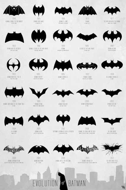
Batman icon evolution
An infographic series depicting the history of the Batman icon. Great to see how this has changed and evolved (or regressed depending on your personal taste) over the years. You can read more from FastCo Designs here
Thursday 17 January 2013
Motherbird CD artwork
Not much needing said here...just have a gawk and drool.
More of their outstanding design work can be seen here.
More of their outstanding design work can be seen here.
Back to the Future Poster series
'The way I see it, if you're gonna build a time machine into a car, why not do it with some style?'
Well Phantom City Creative have certainly done that with these killer Back to the Future posters!
In the words of Marty McFly 'If you put your mind to it, you can accomplish anything.'
Well Phantom City Creative have certainly done that with these killer Back to the Future posters!
In the words of Marty McFly 'If you put your mind to it, you can accomplish anything.'
Re-vision Pop Icons
A remarkable selection of minimalist illustrations depicting various characters form pop culture. The style is seriously something to behold..the utter simplicity, yet it's unmistakable who each card represents. A perfect example of when less is most definitely more!
The presentation kicks ass too!
Check out more work here

The presentation kicks ass too!
Check out more work here

Subscribe to:
Posts (Atom)


