Absolutely loving this guys work. The sense of structure and solidity that he seems to capture with the combination of high speed and the very shallow depth of field never fails to stun! In the following, from the series 'Il Mattino ha l'orro in bocco' Alberto utilizes nuances of metallic inks to embelish the plumes created as the liquid mixes. Here's the link to his website again.
Saturday, 30 November 2013
Thursday, 28 November 2013
Alberto Seveso high speed photography
One of high speed photography's masters, Alberto Seveso serves up a beautiful collection entitled 'Dropping'. Capturing the organic and dynamic colourful forms produced by mixing ink and oil.
You can check out his website here
digital illustration
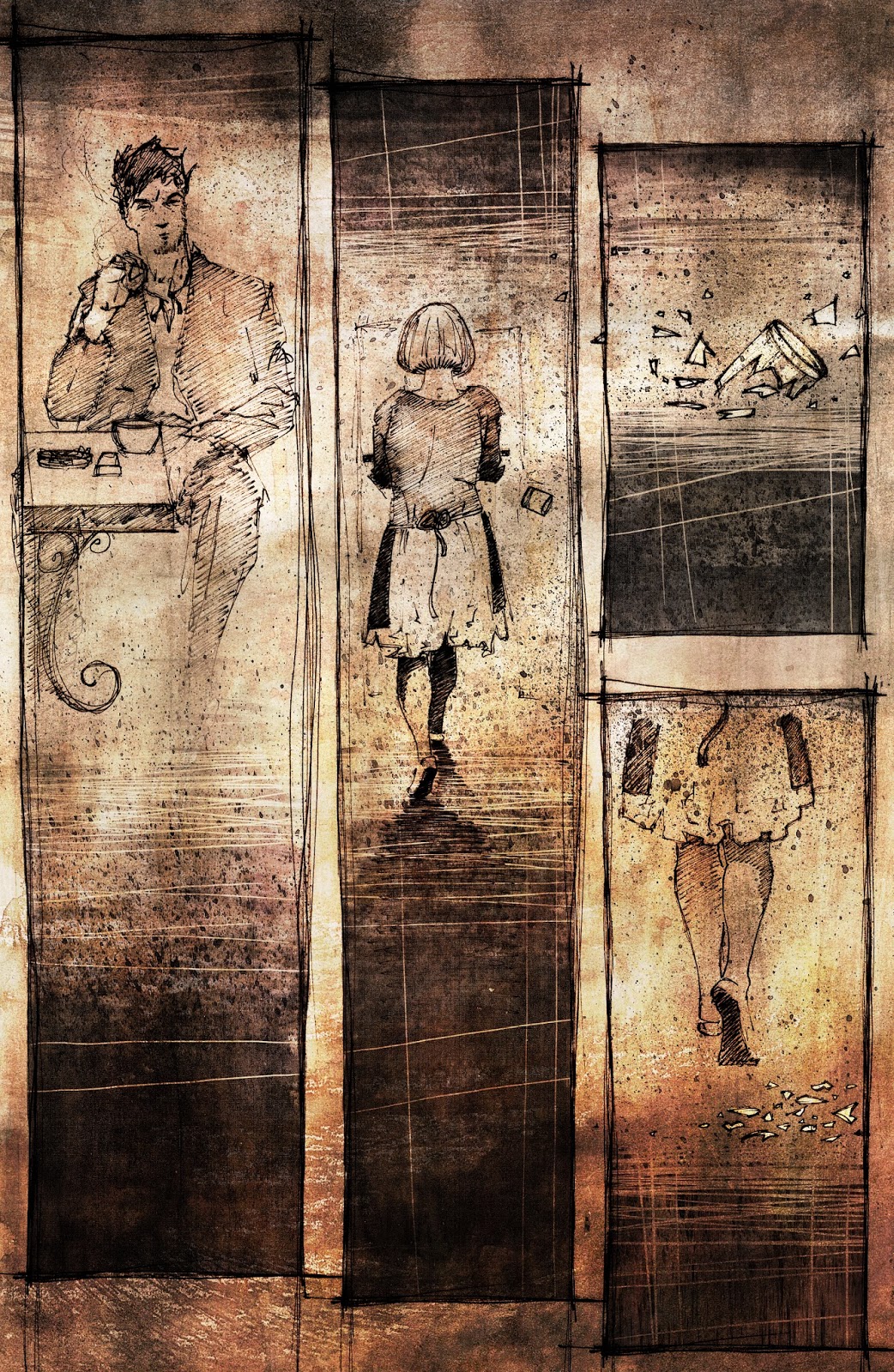
Figured It's about time I put up a little of my own work, all fairly old at this stage. A mix of personal work for uni and commercial comic illustration. Mixed media approach, combining ink sketches,traditional mark-making, photography and photoshop texturing and compositing. Hope ya enjoy.
Friday, 8 November 2013
Friday, 13 September 2013
Kamnin Bank branding
Forward thinking Russian agency b2s6 produced the below for innovative bank Kamnin.
Quite a unique and edgy outcome and nice to see a bit of branding that incorporates a 3D element that isn't just a drop shadow. Have yourselves a wee gawk.
Hot Rods get the INK treatment
Aye, just...aye!
Always been a huge fan of hot rods and the American muscle car look, wish automotive designers today would bring some of these characteristic back...anyway, have a drool over these babies. Created by London based digital production studio, INK.
Tuesday, 13 August 2013
Public Library visual identity
Outstanding piece of visual identity work here by Natalia Bilska. Simple use of colour and icons, used to stunning effect across the full application of print and screen output. Always loved libraries, but would love to have a good gander in here. You can check out more of her projects by clicking here.


Subscribe to:
Posts (Atom)