Sunday, 12 October 2014

Carlos Bermúdez - Sistema Single

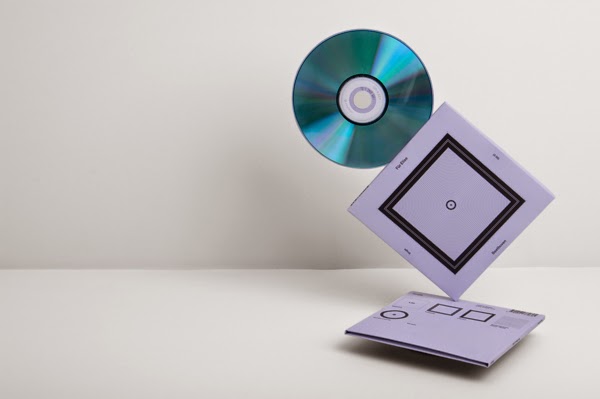
A quite remarkable piece of work by Carlos Bermúdez. An exploration of visual language and how art & design can be used to help express things which are inherently invisible.

As described by Carlos:

"Taking the quote by Joseph Müller Brockmann as its starting point, “Music is invisible and we therefore have to seek its representation out of abstraction”, I propose to create a Graphics system for classifying music base don its characteristics using an abstract and geometric language. The system comprises 56 characteristics grouped into 6 parameters, offering a range of  Over 3.500.000 combinations. The method regarding its use consists of combining the graphically represented characteristics of a song (color, texture and shape) to forma an image that reflects the essence of the music."

Click here to see the full project.


Maria Grønlund

When I joined Behance I always new I'd be inspired and have my mind truly and utterly blown, but I wasn't quite prepared for the quality of some of the work. Maria Grønlund's portfolio is amongst the most inspirational you're ever likely to see, not to mention how helpful and humble she is with sharing techniques and ideas. A true artist in every sense of the word.

Below is just a small selection of work, you can see more on her behance profile here.


Monday, 11 August 2014

McKay skateboarding branding

A bit of work completely lately for McKay, an Irish custom skateboard and apparel creator. Below is just a small snippet of some of the graphics produced. You might view it better via behance.


Saturday, 28 June 2014

Visodental Branding

Below is the result of a project where I was approach by Visodental to develop a brand identity for their dentistry and facial aesthetics clinic.

The name 'Viso', which means 'face in Italian (stemming from the fact the owner's husband is Italian) provided the main inspirational element. Through the ideas generation phase of the project this connection to the Italian theme was something I wanted to keep due to the strong personal ties. The concept for using the 'V' as the basis of the mark came from a combination of, obviously the first letter of the name, but also from the Roman numeral of the clinic's address; number 5, pump street.


One of the main visual problems that needed to be solved was to create a mark that was somehow androgynous; both male and female; yet neither at the same time. The potential client base was extremely dynamic in it's range and it was important that the identity didn't alienate one particular group, by looking too feminine or too masculine. Cutting a somewhat feminine facial profile from the left side of the V was offset by using a strong all caps serif typeface. The use of a monochromatic colour palette also helps create an identity that has pretty neutral feel.


Driven, strong ideas and blunt, straight to the point feedback made this an absolute pleasure of a job to work on and Patricia has done a fantastic job carrying the branding through the interior design of the clinic. I'll try and get some photographs of that soon.


Not to mention it's a top quality service..I can say that as she's helped me overcome the horrific fear of dentists that I use to have!

Hope ya like it.


Wednesday, 25 June 2014

Web icons?

Since I'm on a bit of a web design bender at the minute I figured I should share this site with ya all. Honestly I don't recall how I stumbled across it, but if you're looking for flat icons for web development/UI design you could do worse that check out flaticon.

Icons are available in a number of useful formats including .svg and .psd file. If you use any just be kind and attribute the creator somewhere; after all they've been kind enough to create and distribute these gems for free.

Enjoy!


Sunday, 22 June 2014

Want to learn html and css completely free?

Do your bowels empty at the thought of learning html and css from scratch?
Got a full-time job, so an academic course just isn't feasible?

If you're like me, you'll have answered 'Aye, now yer feckin' talkin' to both of those questions.
Well, here's a wee treat to to put a smile slap bang on the front of your facehole! Codecademy.

If you haven't checked them out, I really can't recommend it strongly enough, (thanks to mr Mark Quinn for telling me about this). Basically it takes you right from the very basics of html with interactive examples and easy to understand descriptions that dont need deciphered by the Enigma code breakers! Did I mention it's absolutely free!?

I make a point here not to endorse products too often (if ever) and I get sweet Fanetta Adams for saying this...but plain and simple, it's by far and away the most intuitive and easiest method of learning html and css I've ever attempted and I've flirted dangerously with more than a few. Literally I've just spent 2 hours going through the tutoirals from the beginning and leanred more this afternoon than in all the weekends and evenings over the last 3 years. To be brutally honest, it's made the geek inside me rather moist!

It's not just html and css either, there's a plethora of coding language, php, javascrip, ruby and a plethora of other top quality instruction, so go check 'em out and see what you reckon!


html free, twinbrush, design, web, html,


Wednesday, 28 May 2014

A tribute to the late, great Massimo Vingelli

I'm sure you're all aware that one of designs true disciples (Maybe prophet is a better word for such a gifted human being), Massimo Vignelli recently passed away. Instead of my own trying to sum it all up I thought it best to let Pentagram's Michael Bierut say it. A very poignant and articulate piece:

Here's a small excerpt:

Finally, from Massimo I learned never to give up. He was able to bring enthusiasm, joy and intensity to the smallest design challenge. Even after fifty years, he could delight in designing something like a business card as if he had never done one before. 

It was Massimo who taught me one of the simplest things in the world: that if you do good work, you get more good work to do, and conversely bad work brings more bad work. It sounds simple, but it’s remarkable, over the course of a lifetime of pragmatism and compromise, how easy it is to forget: the only way to do good work is simply to do good work. Massimo did good work.


Read the full article here.

Sleep well and thank you Massimo.


Monday, 5 May 2014

Tomcat Brothers

Concept artist and digital painter Piotr Joblonski has officially blown my mind...and I'm not alone. The online response to the Tomcat Brothers has been nothing short of astounding...You'll see it's justified from the gorgeous images below.
The initial concept was the adventures of two small borther, wearing futuristic/steampunk space helmets who are accompanied by a giant feline friend., in the form of a huge cat mural. Not only is the idea something specail but the digital painting technique and mastery of light is simply exeptional....read no more and go drool!

Oh some of these panels are now available as prints, click here for more.


El Tatio Geyser Field

Interactive designer and visual artist Owen Perry (based in British Columbia) returned from a trip to the El Tatio heyser field with this collection of beautiful and surreal photographs. The colour, patttern and texture of the mineral formaitons is nothing short of breath taking and caputured perfectly by mr Perry. You can see more posted on Circa1982 by clicking  here.


Tuesday, 4 February 2014

Cyr-Wheel

Not the usual post theme here in terms of design, but if this isn't art and creativity I don't know what is!

Choreographed and interpret by Canadian cyr-wheel artiste Valerie Inertie, in collaboration with Stephan Braun, German composer and Cello player,the video is a truly inspirational piece of structure improvisation; a combination of two art forms coming together in awe inspiring beauty and harmony.


Tuesday, 14 January 2014

Windows of New York

 Here's a small peek at José Guíza’s illustration series entitled Windows of New York there must be nearly a mullion images created as part of this first-glass series; many i sill have to drool over...ok enough pane-ful puns.

 Seriously this is an impressive project and goes to show that there's beauty to be seen everywhere if you just remain open to it..the details and character of each window style is beautifully crafted, particularly the small details that help give indication to the background and upbringing of the inhabitant (or lack there-of).  If the eyes are the window to the soul, perhaps Guiza is proving that windows are the eyes and soul of the city. 

Check out more from his impressively stylish portfolio here.


Monday, 13 January 2014

Rype

Stumbled over this little gem lost in the chaotic labyrinth that is my bookmarks folder. Been meaning to post this for a while. There's not really a lot needing said about the following bit of branding by Ryan Putnam of Rype Arts, just have yourself a look or check out more on Dribbble.


Saturday, 11 January 2014

Kroller-Muller Museum Branding

The Kröller-Müller Museum offers a unique experience of art, architecture and nature. Combining the second largest collection of Van Gogh painting in the world and the largest scuplture garden in Europe,  the museum wanted to reach a bigger and wider audience....in stepped Edenspiekermann, who developed a new brand identity that drew inspiration from themes in nature such as light, form and shadow. The visual language expresses the combination of interior and exterior space which is key to the museum.

The result is an iconic, flexible and colourful system, with strong typography that I have to say I pretty much fell in love with the moment I set eyes on it.